
Vortex’s User-Friendly Design
The world of online dating has changed fast. Many people now want more natural, more relaxed, and more enjoyable ways to connect. Vortex enters this space with a fresh idea and a modern, simple design that makes meeting people feel easy again. Instead of giving users a complicated layout or endless menus, Vortex focuses on clarity, comfort, and real connections. This article explores Vortex’s user-friendly design in detail and explains how every part of the app works to make your experience smooth, fun, and stress-free.
1. A Design Created for Real Human Connections
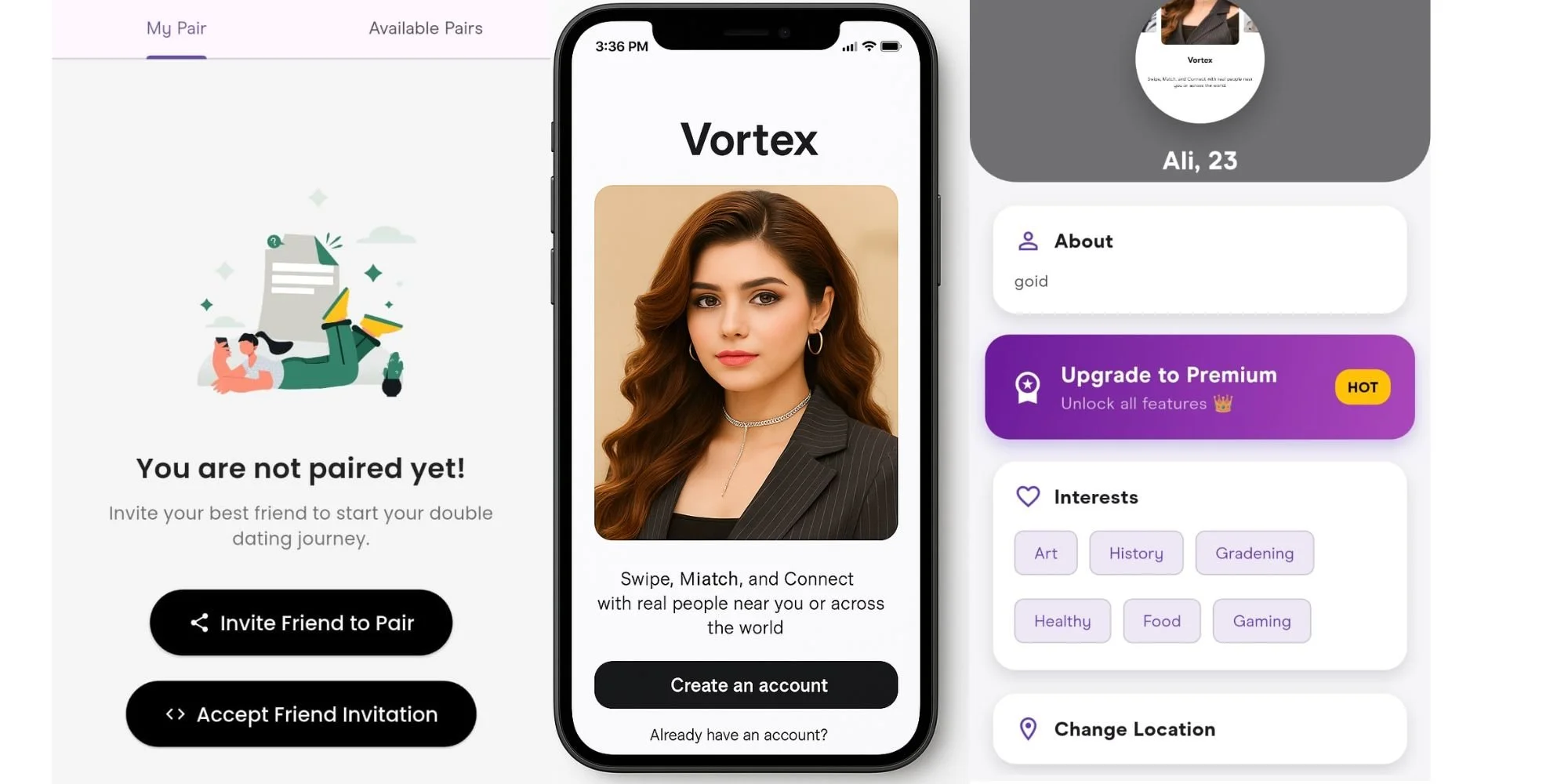
Most dating apps are one-on-one. You swipe, you match, and you hope the conversation starts well. Vortex changes the entire approach by introducing a pair-to-pair matchmaking system. With this feature, you can team up with a friend or partner and match with another duo. This creates a natural, social, and relaxed environment. Many people feel less pressure when they are not alone in the dating process, and Vortex’s design supports this feeling through simple steps and intuitive screens.
The moment you open the app, you notice the clean layout. There are no confusing buttons or complicated instructions. Everything is arranged to help you find matches or explore features without stress. Whether you are new to dating apps or experienced, Vortex makes everything easy to understand.
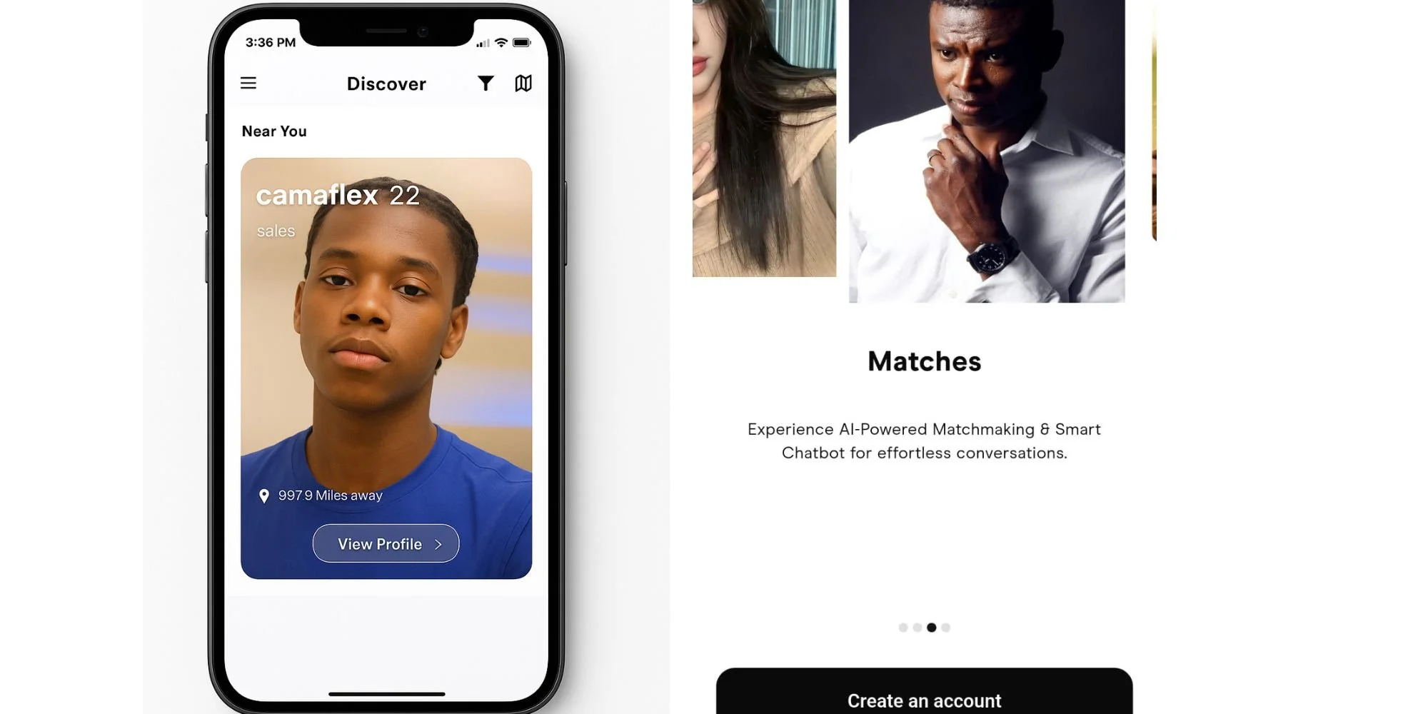
2. Simple Swiping That Feels Natural
Swiping has become a universal motion in dating apps. Vortex takes this familiar gesture and improves it with smooth animations, quick loading, and easy navigation. Users can swipe left or right in a seamless flow. The cards are large, clear, and designed with soft edges and minimal distractions.
The app’s design ensures your eye stays on the profile and not on extra elements. You can see the person’s photo, name, a few important details, and then swipe to the next card. This simple and clean approach keeps the experience fast and enjoyable.
Vortex uses a modern, minimal color palette. This helps users stay focused and relaxed while exploring matches. There are no bright flashing colors or complex backgrounds. The experience feels comfortable, calm, and inviting.
3. “Deuces” – A Unique Feature Designed for Fun and Bonding
One of Vortex’s standout features is Deuces, the double-dating mode. This feature was created to make social interaction easier. Instead of going on dates alone, users can connect with another pair. It can be you and your friend, you and your partner, or even siblings or coworkers. The pairing experience is built into the app’s design in a very simple way.
The Deuces interface is clear and friendly. You choose your partner, set your joint profile, and begin matching with other duos. Each duo profile card shows photos of both members, making it easy to see who you are connecting with. The layout is balanced so that both people feel included.
This feature is designed not just for dating. You can use Deuces to:
Make new friends
Find double dates
Create group hangouts
Build long-term social circles
Explore new experiences
The user interface gives equal space to both members of your pair, so the app always feels fair, equal, and comfortable.
4. AI-Powered Matchmaking That Works Behind a Simple Interface
The matchmaking engine in Vortex uses artificial intelligence to study your preferences, swiping patterns, and behavior to suggest better matches. However, the app does not overwhelm you with technical details. Instead, it keeps the interface soft and friendly. You simply see high-quality suggestions as you swipe.
The AI works silently in the background. You see only the results: more accurate matches, profiles that feel relevant, and a smoother experience. This is part of Vortex’s design philosophy — give users powerful features but present them in a way that feels simple and easy.
AI also improves recommendations for Deuces. It studies the compatibility of pairs based on interests, activity, and profile traits, helping pairs find other duos that match their vibe.
5. Smart Chatbot for Effortless Conversations
Starting a conversation can be difficult. Many users do not know what to say or how to keep the chat going. Vortex includes a smart chatbot that helps users begin conversations easily.
The chatbot is integrated into the chat window in a minimal and non-intrusive way. It may suggest:
Conversation openers
Fun topics
Ice breakers
Natural replies
This makes the chat flow better. The design of the chat screen is simple and clean, making sure users feel comfortable. The messages appear clearly, with enough space between them, and the layout supports easy reading. The chatbot suggestions appear lightly, so they do not interrupt but only assist.
6. Map-Based Discovery With a Clean and Clear Interface
One of the most exciting parts of Vortex is map-based discovery. This feature lets you see users who are nearby in real time. It gives you the chance to meet people who are actually close to where you are.
The map view is designed with clarity in mind:
The map layout is simple.
User dots or pins are clear and easy to understand.
You can zoom in and out smoothly.
The screen does not feel crowded.
This feature helps users explore local social opportunities. It is helpful for both single matches and Deuces. Whether you want to find people in your area or look around other cities, the design makes it easy.
7. A Modern, Minimal, and Distraction-Free Layout
The foundation of Vortex’s user-friendly experience lies in its minimal design. Every screen is clean. There are no heavy graphics. The fonts are simple. The spacing is neat. Buttons are large and clear. This makes Vortex feel light and enjoyable.
Minimal design also reduces user fatigue. You can swipe for longer periods without feeling overwhelmed. The idea is to make the experience feel natural instead of tiring.
The developers have chosen a soft color palette, modern icons, and smooth transitions. This gives the app a premium feel while still keeping it approachable.
8. Fast and Responsive Performance
Speed is an important part of user experience. Vortex loads pages quickly. Swipes respond instantly. Chats open in seconds. The app has been optimized for Android devices, especially models that may not be the latest versions.
The simple design also helps reduce lag. The app uses clean graphics and lightweight animations, ensuring that performance remains smooth even on older devices.
9. Privacy and Security Built Into the Design
One of the strongest features of Vortex is its commitment to privacy. The developer clearly states:
No data is collected.
No data is shared with third parties.
This is rare in modern dating apps. Many apps collect user data for advertising or analytics, but Vortex is designed to protect user privacy.
The interface reflects this commitment. You do not see unnecessary data forms or repeated requests for personal information. The app only asks for:
A username
Basic profile details
Location access for showing nearby matches
There is no tracking, no background collection, and no sharing of information.
Location Permission Design
When users create an account, the app clearly explains why location access is needed:
“We need your location to show you nearby matches. Your location is kept private and secure at all times.”
This message is short, transparent, and reassuring. The design of the permission screen is clean and easy to understand, helping users feel safe.
10. Vortex Premium Presented in a Simple, Honest Way
Some apps pressure users to buy premium features. Vortex does not. It presents its Premium options in a clear, friendly way. The premium screen shows exactly what you get:
Unlimited swipes
Unlimited likes
Unlimited calls
Extra visibility
Exclusive features
Faster discovery
The layout is modern and clean, with short descriptions and simple icons. This keeps the premium experience easy to understand and user-friendly.
11. Regular Updates and Improvements
Vortex is updated regularly. Each update brings new features, performance improvements, and design enhancements. The developer is active and responsive, making sure the user experience keeps improving.
The update notes are simple and transparent. This helps users trust the brand and stay connected with new features.
12. Overall Feel of the Vortex Experience
When you use Vortex, you notice that everything is built around comfort and clarity. The app feels light, modern, and social. It offers unique features like Deuces and AI matchmaking but presents them in a simple way.
Every part of the design supports real connections. Whether you want friends, dates, or double-date experiences, the app makes it easy. The combination of minimal design, strong privacy protection, smart features, and smooth performance creates a truly user-friendly experience.